
Times Square Visitor Center
POSTED ON: 12.21.2010
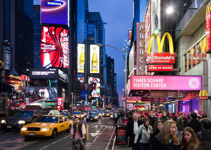
In Times Square, one of the most popular tourist destinations in the world, it is a challenge to create places for visitor services and information. The Visitors Center gives new life to the retired Embassy movie theater, located at 47th Street & Broadway, directly opposite the new ruby-red stepped TKTS booth. Part museum and part zeitgeist happening, with healthy dollops of theatricality and sleek sophistication, this re-purposed space straddles the 20th and 21st centuries to reflect the continuity and vitality of the world’s crossroads.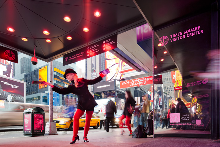
POSTED ON: 12.21.2010
Just as Times Square has been the stage for various desires, the need to congregate and celebrate, honor or mourn, the impulse to buy and sell, to see and be seen, to remember and also to forget - this former theater uses mirrored surfaces to combine different realities, past and present, wherein visitors themselves become part of the show.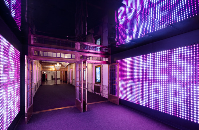
POSTED ON: 12.21.2010
The Visitors Center experience starts on the street. Having lost the Embassy’s illuminated marquee and needing to compete for recognition amid street clutter and crowds, a poster campaign on trash bins and a vinyl graphic overhead catch the visitors attention and bring them to the redesigned entry with its low resolution LED’s installed to create a media portal and reflective interior. They stretch from floor to reflective ceiling which gives everybody a chance to see themselves up in lights, if only for a moment.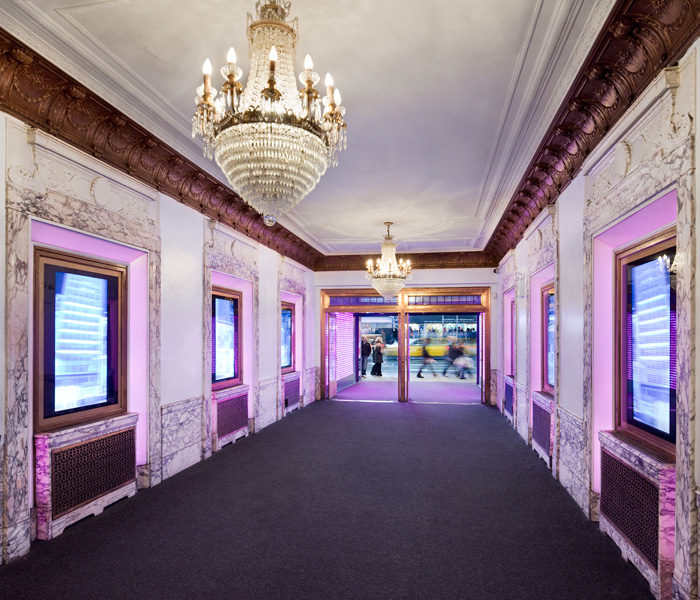
POSTED ON: 12.21.2010
The question was how to keep the theater and its colorful past intact while efficiently serving modern functions, and how to repurpose a landmark without altering it. It was a case of do but don’t, change without touching.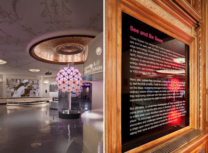
POSTED ON: 12.21.2010
W X Y’s solution to the physical space covered both the overlapping functions, and the need for identity graphics and way-finding. Although the project was very quick and relatively inexpensive, in keeping with Times Square’s cutting edge displays, it was also technologically advanced, using a parametric design and delivery system for its central glass kiosk.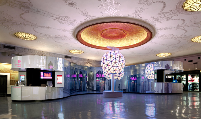
POSTED ON: 12.21.2010
This mirror/media portal, new media poster cases, and the identity graphics orient visitors to the center of the old movie theater: a freestanding curved reflective glass structure whose design is a gradient of reflectivity, shaped like a large amorphous barbell. People circulate naturally around it much as water flows around a rock in a river.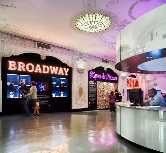
POSTED ON: 12.21.2010
Service counters are housed in the "weights" on either side.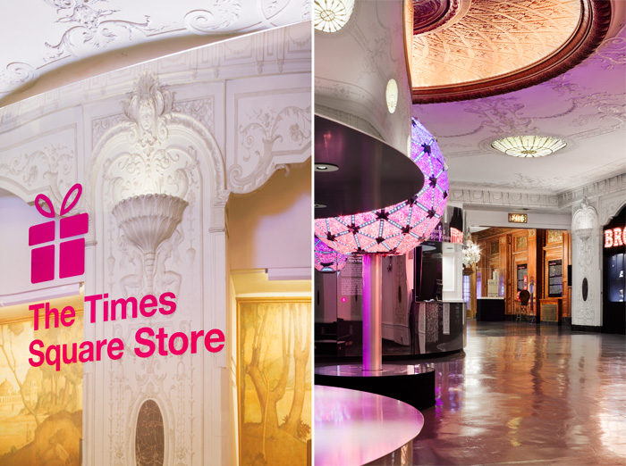
POSTED ON: 12.21.2010
The ball, the lights, the historic interior, and the visitors are all mirrored in the curves of the barbell so that the whole experience takes on an almost surreal, funhouse dimension. Entertainment and information become equals in design, everyone is taking pictures.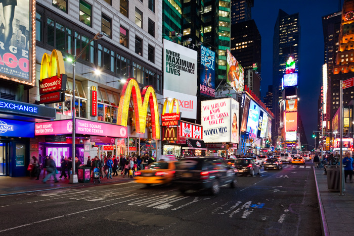
POSTED ON: 12.21.2010
View of the exterior of the Visitor Center at night.POSTED ON: 12.21.2010
Collaborators:
Front, Inc. (glass engineering and fabrication)
Imaginary Forces (media design)
Kyle Chepulis (lighting Design)
Sciame (construction management)
Front, Inc. (glass engineering and fabrication)
Imaginary Forces (media design)
Kyle Chepulis (lighting Design)
Sciame (construction management)
Photography: Paul Warchol Photography
